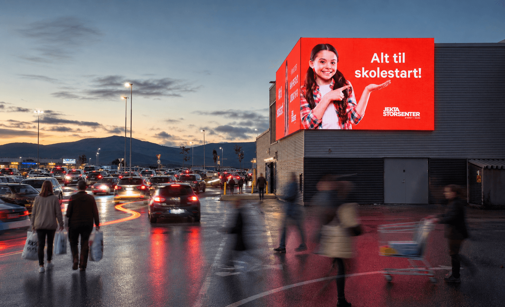
Follestad Trend
Follestad Trend ønsket digitale løsninger som støtter butikkopplevelsen og merkevarene de representerer – uten å gå på kompromiss med kvalitet eller uttrykk. Vi har levert digitale flater til nærmest hele Follestad-kjeden, fra LCD-skjermer integrert i butikkinteriøret til store, høyoppløselige LED-skjermer som tilfører butikkene en ekstra visuell opplevelse. Med Follestads høye kvalitetsnivå stilles det tilsvarende krav til oppløsning, fargegjengivelse og helhetsinntrykk. Alle skjermer styres enkelt og sentralt, noe som sikrer konsistent kommunikasjon og effektiv drift på tvers av butikkene.
Follestad Trend | Motekjede
Digitale flater på premium-nivå
2024

01 Resultat
En raffinert og kontrollert digital butikkopplevelse som forsterker premium-uttrykket, løfter presentasjonen av kolleksjoner og gir Follestad full kontroll over innhold og kvalitet.


02 Our Approach
Our Approach
We treated titling as its own creative process—intentional, test-driven, and rooted in the brand’s tone. Each title was approached like a product pitch: it needed to be clear, compelling, and concise.
Used A/B testing for short vs. long titles.
Explored title types: declarative, question-based, poetic, functional.
Applied voice consistency across CMS and static sections.
Evaluated readability across breakpoints and dark/light themes.
This helped us develop a flexible naming system that can scale across use cases—portfolio projects, services, blog posts, and even microcopy.

03 Results & Impact
The refined title system didn’t just improve aesthetics—it led to measurable shifts in user behavior. Visitors showed stronger engagement with clearly framed titles, especially on CMS collections and project landing pages.
Beyond the visuals, titles created a smoother experience and made complex content feel more approachable.
24% increase in click-through on project cards with improved titling.
17% longer average time spent on case study pages.
Reduction in bounce rates on overview sections.
Positive feedback from users citing “clarity” and “easy to navigate.”
Ultimately, this experiment highlighted how even the smallest elements—when treated with intent—can unlock big results.


Se flere prosjekter

Follestad Trend
Follestad Trend ønsket digitale løsninger som støtter butikkopplevelsen og merkevarene de representerer – uten å gå på kompromiss med kvalitet eller uttrykk. Vi har levert digitale flater til nærmest hele Follestad-kjeden, fra LCD-skjermer integrert i butikkinteriøret til store, høyoppløselige LED-skjermer som tilfører butikkene en ekstra visuell opplevelse. Med Follestads høye kvalitetsnivå stilles det tilsvarende krav til oppløsning, fargegjengivelse og helhetsinntrykk. Alle skjermer styres enkelt og sentralt, noe som sikrer konsistent kommunikasjon og effektiv drift på tvers av butikkene.
Follestad Trend | Motekjede
Digitale flater på premium-nivå
2024
01 Resultat
En raffinert og kontrollert digital butikkopplevelse som forsterker premium-uttrykket, løfter presentasjonen av kolleksjoner og gir Follestad full kontroll over innhold og kvalitet.
02 Our Approach
Our Approach
We treated titling as its own creative process—intentional, test-driven, and rooted in the brand’s tone. Each title was approached like a product pitch: it needed to be clear, compelling, and concise.
Used A/B testing for short vs. long titles.
Explored title types: declarative, question-based, poetic, functional.
Applied voice consistency across CMS and static sections.
Evaluated readability across breakpoints and dark/light themes.
This helped us develop a flexible naming system that can scale across use cases—portfolio projects, services, blog posts, and even microcopy.
03 Results & Impact
The refined title system didn’t just improve aesthetics—it led to measurable shifts in user behavior. Visitors showed stronger engagement with clearly framed titles, especially on CMS collections and project landing pages.
Beyond the visuals, titles created a smoother experience and made complex content feel more approachable.
24% increase in click-through on project cards with improved titling.
17% longer average time spent on case study pages.
Reduction in bounce rates on overview sections.
Positive feedback from users citing “clarity” and “easy to navigate.”
Ultimately, this experiment highlighted how even the smallest elements—when treated with intent—can unlock big results.
Se flere prosjekter
Follestad Trend
Follestad Trend ønsket digitale løsninger som støtter butikkopplevelsen og merkevarene de representerer – uten å gå på kompromiss med kvalitet eller uttrykk. Vi har levert digitale flater til nærmest hele Follestad-kjeden, fra LCD-skjermer integrert i butikkinteriøret til store, høyoppløselige LED-skjermer som tilfører butikkene en ekstra visuell opplevelse. Med Follestads høye kvalitetsnivå stilles det tilsvarende krav til oppløsning, fargegjengivelse og helhetsinntrykk. Alle skjermer styres enkelt og sentralt, noe som sikrer konsistent kommunikasjon og effektiv drift på tvers av butikkene.
Follestad Trend | Motekjede
Digitale flater på premium-nivå
2024
01 Resultat
En raffinert og kontrollert digital butikkopplevelse som forsterker premium-uttrykket, løfter presentasjonen av kolleksjoner og gir Follestad full kontroll over innhold og kvalitet.
02 Our Approach
Our Approach
We treated titling as its own creative process—intentional, test-driven, and rooted in the brand’s tone. Each title was approached like a product pitch: it needed to be clear, compelling, and concise.
Used A/B testing for short vs. long titles.
Explored title types: declarative, question-based, poetic, functional.
Applied voice consistency across CMS and static sections.
Evaluated readability across breakpoints and dark/light themes.
This helped us develop a flexible naming system that can scale across use cases—portfolio projects, services, blog posts, and even microcopy.
03 Results & Impact
The refined title system didn’t just improve aesthetics—it led to measurable shifts in user behavior. Visitors showed stronger engagement with clearly framed titles, especially on CMS collections and project landing pages.
Beyond the visuals, titles created a smoother experience and made complex content feel more approachable.
24% increase in click-through on project cards with improved titling.
17% longer average time spent on case study pages.
Reduction in bounce rates on overview sections.
Positive feedback from users citing “clarity” and “easy to navigate.”
Ultimately, this experiment highlighted how even the smallest elements—when treated with intent—can unlock big results.